An engineer asked me this in a thread this morning and I realised nobody answers it properly: I run a resume parser, pdfTeX files come through it regularly, and the honest answer is that LaTeX resumes parse better than the average Word export, with two traps that are invisible on screen and catch exactly the people who care most about getting it right. Here is what I see, why it happens, and the three lines of preamble that fix it.
- LaTeX PDFs have a real text layer, embedded fonts and, in most templates, a single column. That is three of the four things that matter, so they land in the clean group more often than not.
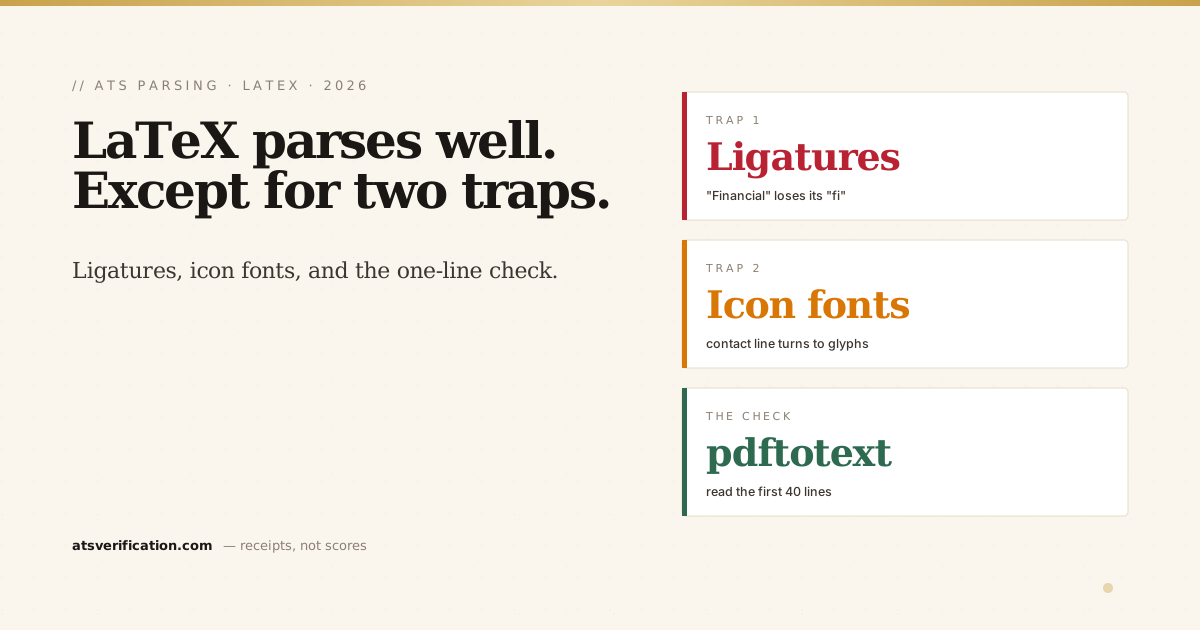
- Trap 1, ligatures: pdfTeX merges "fi", "fl", "ff" into single glyphs. Some extractors return them as one special character, so "Financial" no longer contains the string "fi" and a keyword search for "financial" misses it.
- Trap 2, icon fonts: the FontAwesome envelope and phone symbols in the contact line extract as garbage characters, the same failure as icon bullets in Word.
- The fix is a few preamble lines plus the right template choice. Then one terminal command tells you exactly what a parser will receive.
- Two-column LaTeX templates scramble exactly like two-column Word files. AltaCV, Deedy and their cousins look superb and read in the wrong order.
Why LaTeX starts ahead
A parser does not see your resume. It extracts the text layer of the file and fills a database from it, in whatever order the file hands the text over. Most of the damage I see in the live data comes from layout decisions: skills in tables, text in headers, two columns, decorative bullets, fonts that never got embedded. LaTeX avoids several of those by default. The text layer is real, fonts are embedded, and the templates engineers reach for first, Jake's resume, moderncv, the plain article class with a few custom commands, are single-column documents with ordinary section headings. I see those files come through and parse close to perfectly.
So if you already have a one-column LaTeX resume, you are most of the way there. The remaining problems are the ones you cannot see by looking at the PDF.
Trap 1: ligatures
TeX typesets "fi", "fl", "ff", "ffi" and "ffl" as single ligature glyphs because that is what fine typography does. The problem is downstream: when a parser extracts that text, it depends on the PDF carrying a proper mapping from glyph back to characters. With some pdfTeX font setups that mapping is incomplete, and the extractor returns the ligature as one special character rather than two letters. On screen "Financial" looks perfect. In the database it may be stored as F-fi-n-a-n-c-i-a-l, and a recruiter's search for "financial" returns nothing, because the string "fi" is not in it. The same goes for "efficient", "profile", "workflow", "staff", "office" and every other word in your vocabulary that happens to contain one of those pairs.
Three ways to fix it, pick by engine:
- pdflatex: load
\usepackage[T1]{fontenc},\usepackage{lmodern}and\usepackage{cmap}. The cmap package writes a ToUnicode map into the PDF so ligature glyphs extract as their letters. T1 encoding also fixes accented characters, which in the old OT1 default extract as a base letter plus a floating accent. - Belt and braces on pdflatex:
\usepackage{microtype}then\DisableLigatures{encoding = *, family = *}. No ligatures are typeset at all, so there is nothing to mis-extract. The microtype documentation covers the option. - XeLaTeX or LuaLaTeX with fontspec:
\setmainfont{YourFont}[Ligatures=NoCommon]. Same outcome, one option.
A resume is not a novel. Nobody on an admissions committee or a hiring panel will notice the absence of an "fi" ligature. A keyword filter will absolutely notice its presence.
Trap 2: icon fonts in the contact line
Templates love a small envelope before the email address and a phone glyph before the number, usually from FontAwesome via \faEnvelope and friends. To a human that reads as polished. To a parser the icon is a character from a symbol font with no meaningful Unicode mapping, so it extracts as a stray glyph glued to your email address. In the worst case the parser's contact detection, which is looking for a clean email pattern, fails on the line entirely. This is the LaTeX version of the icon-bullets failure that affects 18 percent of the resumes I see. Fix: drop the icons and write the labels, or just the values. "Email: you@example.com" parses. A tiny envelope does not.
The template decision that matters more than both
Everything above is a preamble fix. The template choice is structural. The beautiful two-column LaTeX resumes, AltaCV, Deedy, the Awesome-CV sidebar variants, produce PDFs whose text layer is read top to bottom, one column at a time. The sidebar's skills land in the middle of your work history, dates detach from their jobs, and the result is the two-column scramble I wrote about in are two-column resumes ATS-friendly. LaTeX does not rescue you from that; it just renders the scramble in Computer Modern. Pick a single-column template, keep the headings boring, and use the full width.
Two smaller points from the same family: put dates on the same line as the job title, right-aligned with a tab stop rather than in a separate column (the date format guide has the safe patterns), and keep section headings as plain text, not small caps in a custom font, so the parser can classify them.
The one-line check
You compiled it, so you have a terminal. Run:
pdftotext resume.pdf - | head -40That prints roughly the text layer a parser receives. Read the first screen. If your name is on the first line, the contact line is clean, the first job title has its dates next to it, and "Financial" comes out as F-i-n-a-n-c-i-a-l, you are done. If you want the strict version, with the failures named and the extracted text shown next to your original, the free scan does the same thing in the browser with no signup. Either way you are checking the layer that matters, which is the one the PDF viewer never shows you. (The copy-paste version of the same test, for people without a terminal, is in the copy-paste ATS test.)
Where engineers actually lose
Not in the parse, usually. The files I see from LaTeX users are structurally fine far more often than the Canva ones. Where they lose is the content underneath: bullets that list technologies without outcomes, and the assumption that a clean compile means a strong resume. The parse check above takes a minute. The harder work is the part covered in ATS resumes for software engineers, and no package fixes that.