I have written my own resume more times than I can count, screened hundreds from the hiring side in finance, and then built a scanner that has now read the raw parsed text of more than 2,400 real ones. That combination changed how I write a resume. Most guides teach you to please a reader who never sees the file, because software reads it first and quietly decides what to hand over. This is the process I actually use, in order, with the parts nobody tells you.
- Structure before sentences. Single column, standard headings, real text. Get this wrong and the writing never gets read.
- One resume per target role, not one resume for everything. The job posting is your brief.
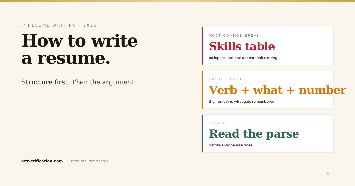
- Every bullet is a verb, a thing you did, and a number. Missing the number is the most common reason a good career reads as ordinary.
- Skip the skills table. In our live data it is the single most common parsing failure, affecting about two in five resumes.
- Read your own parsed text before you send. It takes seconds and it is the only way to know what the recruiter actually receives.
Step 1: Decide what job this resume is for
A resume is not a biography. It is an argument that you can do one specific job, and an argument needs a subject. Before writing a word, pick the role you are targeting and find three or four real job postings for it. Those postings are your brief: they tell you the vocabulary, the seniority signals, and the two or three things every employer in that niche cares about.
This is also the moment to be honest about what you are leaving out. A resume that lists everything you have ever done is a resume with no argument in it. My own has a section I cut every time I apply for finance roles, and put back when the audience is different. Cutting is not lying. It is answering the question you were asked.
Step 2: Fix the structure before you write a single sentence
This is the step almost every guide puts last, and it is the reason good resumes disappear. Applicant tracking systems do not read your document the way you see it. They extract the text layer and try to rebuild it into fields: name, employer, title, dates, skills. If the layout confuses that extraction, the recruiter sees a mangled record and your writing never gets a hearing.
The rules are boring and they work:
- One column. No sidebars. A parser reads side by side text across the page, so a sidebar gets interleaved into your job history. In our own controlled layout test, two columns were the only layout of six to draw a critical failure.
- Standard section headings. Summary, Experience, Education, Skills. "My Journey" and "What I Bring" are invisible to a system looking for known labels. More on this in section headings that parse.
- Contact details in the body, never in the page header or footer, where many parsers never look.
- No text boxes, no graphics, no icons. Text inside a box is often skipped completely, and icon bullets arrive as empty squares.
- Real selectable text. If you cannot select and copy a word in your own PDF, it is an image and it extracts as nothing at all.
The full formatting logic, with the reasoning behind each rule, is in the ATS-friendly format guide. If you would rather not build it yourself, our free Word templates already follow every rule above, with no email required to download them.
Step 3: The header, which is simpler than people make it
Name on its own line, in normal body text rather than as a graphic. Then one line with phone, email and a LinkedIn URL. City and country are enough for location; a full street address adds risk and no value, which I explain in should you put your address on a resume.
One quiet detail worth checking: in our live scans, the parser fails to identify a candidate's name in about a quarter of resumes, usually because it sits in a header or a graphic. The application then arrives with an empty name field. It is the most avoidable failure on this list.
Step 4: The summary, and when to skip it
Three lines at most, and only if you have something specific to say. A good summary states what you are, your scope, and your single strongest proof:
"Regional finance manager, eight years across the UAE and Oman, currently directing reporting for three legal entities and a USD 100M portfolio."
A bad summary is made of adjectives: hardworking, detail-oriented, passionate, results-driven. Every candidate claims those, so they carry no information and burn the most valuable space on the page. Harvard's career services guidance makes the same point in stricter language: describe accomplishments, not responsibilities or traits. If your summary could sit on someone else's resume without changing a word, delete it and start the Experience section higher up. Students and career changers are the exception: a short summary is where you explain a jump the reader would otherwise puzzle over.
Step 5: Experience, which is where the whole thing is won
Format each role the same way, and keep dates consistent throughout:
Job Title
Company, City, Country | Jan 2021 to Present
Then bullets. The formula I use and look for when hiring is simple: a strong verb, the thing you did, and a number that shows the size of it.
Compare these two, which describe the identical job:
- Responsible for month-end close and reporting duties.
- Closed month-end for three legal entities in six working days, two days faster than the prior year.
The first tells me the job existed. The second tells me how big it was, how well it was done, and gives me something to ask about in an interview. When I was screening, the second kept me reading and the first did not. This is not a personal preference; it is the most consistent finding in the research on resume screening, and Harvard Business Review puts it plainly: quantified accomplishments are what separate the resumes that get read from the ones that get skimmed.
People get stuck on the number because they think they do not have one. Almost everyone does. How many people, how much money, how many transactions, how often, how much faster, what percentage. Even "trained four new joiners" beats "responsible for training". There is a longer treatment of this in how to quantify achievements, and if you want a repeatable sentence pattern, compare the options in STAR versus XYZ bullets.
Two more rules I hold to. Lead each bullet with the verb, not with "Responsible for" or "Tasked with", which push the interesting word to position four. And use plain past tense verbs rather than reaching for a thesaurus: the action verbs that actually help are ordinary words like led, built, cut, negotiated and rebuilt.
Give your most recent and most relevant role the most bullets, four to six. Older roles shrink to two or three. Anything more than about ten years back can usually be one line, or nothing.
Step 6: Skills, and the trap that catches two in five people
Write skills as a simple comma separated list under a plain "Skills" heading. Do not build a table. Do not build a three column grid. Do not use rating bars.
I am emphatic about this because it is the single most common failure in our live data: in more than 2,400 real documents scanned, a flattened skills table appears in roughly 40% of them. What happens is that the table collapses into one run of joined words, so "Excel SAP Power BI" becomes a single unsearchable string. Your skills are technically still in the file, and not one of them can be found by a recruiter filtering for that keyword. You can watch the numbers move yourself on our live ATS data report.
List the skills the posting names, in the posting's own words, and only the ones you would be comfortable being questioned on. Nine or ten specific tools beat thirty vague ones.
Step 7: Education, certifications, and everything else
Degree, institution, year. Recent graduates put education above experience and can add relevant coursework, a strong GPA, or a capstone project; everyone else puts it at the bottom and keeps it to one line per qualification. Professional certifications go in their own short section if they matter in your field, which in mine they very much do.
Hobbies, references and photographs: skip all three in most markets. "References available on request" is assumed and wastes a line. A photograph is expected in some Gulf and European markets and can create bias problems in the US and UK, so follow local convention rather than a global rule. The photo also frequently breaks parsing, which is a separate reason to leave it off unless you know it is expected.
Step 8: Length, settled
One page if you have under about eight years of experience. Two pages after that. Three only for academic CVs and senior technical roles with publications or patents. The real test is not the page count but whether every line earns its place: I have seen one-page resumes that padded and three-page ones that could not be cut. The longer discussion of length covers the edge cases.
Step 9: Tailor it, without keyword stuffing
Keep one master resume, then make a copy for each application and spend ten minutes on it. Change the summary to name the target role. Reorder bullets so the most relevant sit at the top of each job. Mirror the posting's exact vocabulary where it is honestly true of you: if the ad says "month-end close", write "month-end close" rather than "periodic financial reporting", because that is the phrase a recruiter searches for.
What you must not do is paste a keyword list into white text or stuff terms you cannot defend. Recruiters find it, and it reads as dishonest at exactly the moment you are asking to be trusted. The line between mirroring and stuffing is drawn carefully in tailoring without keyword stuffing.
Step 10: File format and file name
Send .docx unless the posting asks for PDF. Both parse well when built correctly, but Word files are more forgiving across older systems, and some portals still convert PDFs badly. Name the file with your own name: Ahmed-Khan-Resume.docx, not resume-final-v3.docx. Recruiters download hundreds into one folder, and yours should be findable by a human as well as a machine.
The last step, which almost nobody does
Before you send it anywhere, read the text a parser pulls out of your file. Not the pretty version you designed. The extracted version the recruiter's system builds.
You can do a rough version of this yourself in ten seconds: open your PDF, select all, copy, and paste into a blank text file. If your name is the first line, your dates sit beside the right employers, and your skills come out as separate words, you are in good shape. If it reads as a scrambled mess, so does the copy in the recruiter's database, and nothing else on this page matters until that is fixed.
That check is the reason I built the free scanner: it shows the same extracted text with every detected issue named and a one line fix for each. It costs nothing and no email is required. If the parse is broken, our rebuild will fix the file for you, or you can take the fix list and do it yourself in Word. Both are fine by me. What is not fine is sending a resume you have never seen the way the software sees it.
The mistakes I saw most from the hiring side
- Duties instead of achievements. A list of responsibilities describes a job description, not a person.
- The same resume everywhere. Obvious to the reader within seconds, and it signals volume applying.
- Adjective stacking. Dynamic, motivated, detail-oriented. Show it, do not claim it.
- Unexplained gaps. A gap is fine, a gap you have to guess about is not. One honest line settles it.
- Design over structure. The most beautiful resumes I received were the ones the system had most often mangled before it reached me.
Two companion pieces if you want to go deeper on single sections: resume summary examples for the three lines at the top, and why your resume PDF will not upload if a portal is refusing your file outright.
None of this is difficult. It is just ordered differently from the way most people do it: structure first, argument second, decoration never. Get the file readable, make every line earn its place, and then check what the machine actually extracted before you hit send.
The experience section carries the most weight and breaks most often. Its own guide is here: how to write the work experience section.